There are so many different influential videos that we could compare certain aspects of our video to. However there was two particular videos “ The Same Girl” By Usher and R. Kelly and The Original Video Of “The Boy is mine” by brandy and Monica that we used to influence and inspire the ideas we used on our video. Both of the videos displayed a similar Narrative to the video we produced. However we tried to differ the two videos from ours by using different shots and effects, as well as using one girl (Alex) more than the other girl (Kathryn). Doing this instantly showed the contrast between the two girls mainly highlighting the fact that(Monica e.g. Alex) has a higher chance of getting the boy than (Brandy e.g. Kathryn) does. Whereas in the original “the boy is mine” video None of the girls got the boy, and in “the same girl” video they realise and were convinced that the girl they both like was cheating, whereas in the end we see that the girl was in fact a twin.
We chose to make our video a narrative because the pace of the song is slow therefore it is much more effective if the storyline and the song words link together. The style of the boy is mine video is R&B which is often seen as a genre that constantly consists of people showing off their cars, money and success. These are the typical code and convections of R&B. The locations used in the “the same girl and the boy is mine” show that a lot of money was used on the videos, which limited our product because we did not have the high quality equipment and a high income to create a high quality video.
One way In which the “same girl” video inspired our video was the shots in which they used. They used a split screen of Usher and R.Kelly whilst on the phone to show ushers facial expression as he starts to realise, that R.kelly is in fact describing the same girl the he is in love with. We decided to use a split screen in our video as well, however and we made it different from the same girl video is we used an effect that blended and image of the main boy (Eugene) in the middle of the split screen, whereas they had shots focusing and flicking between to two different scenes, the split screen scene and the scene with just the main girl. In “the boy is mine” video there are scenes where both of the characters are discussing their problems with their separate groups of friends . Whereas the form In our version of the video was entirely different because we tried to ensure that there were only three characters throughout the whole music video
I believe our video managed to challenge the terms of producing a real media music video as we used different ideology to the original high quality videos as well as use a completely different scenario. Professional music videos are produced from high tech equipment and technology and seeing that our music video was created at an amateur level I believe it’s at a good standard and highly attracts and connects with the audience.
In the instance of our poster advertisement the genre is R'n'B, we chose to stage a scene that illustrated a brief indication what the story was about 'a guy torn between two girls.' In which the boy is holding one of the girls while the other looks on or one where the two girls are looking down at the camera, as if looking down on the boy for cheating. I chose to make it black and white, sketchy looking and tonal so that it looked like graffiti which is associated with the young mainstream urban musical artists of today’s generation. I chose a simple cutting edge font for the advertisement slogans and a classic elegant sans serif font for the title because their are two female remodels featured. As the women being two-timed isn't an original idea; people can relate on some level to personal experience, as it's just as relevant now as it was in the past.
My composition and font choice was inspired by Beyonce's poster for 'I am’. I chose to use the same font and black background because she's a professional celebrated artist and entertainer. I wanted to mimic that image, the stage persona Beyonce's renowned for because she is successful. As is highly respected Dr.Dre not just as a musician but also an actor and American record producer who adopts the same high contrasting imagery.
Here is the Beyonce poster i have refered to:
I decided to include a star rating, as I seen in other magazine advertisements because’ critical endorsement’ is a highly influential form of advertisement. When names of magazines; considered to have a governing authority of mainstream genres is used this will influence the appropriate audience that want to be associated with that identity group. (E.g. VIBE, KING, and RAP R’n’b, Interview ECT’)
Here is some of the older posters:

Here is the finshed and final poster:

We have also used Photoshop to create are CD cover as well as the magazine advertisement.
As the two singers are both girls I have based the colour scheme on a girly theme, so the background is a dark bold pink, with at little lighter colour pink for the words ‘The Boy Is Mine’ going across the background. Then we have used a pure white for the initials ‘B&M’ and ‘The boy is Mine’. But to make the name of the song and initials stand out I have added an outer glow effect to make it brighter and stand out more, especially for a customer in a shop.
The front cover just had these features and after asking the opinion of some fellow classmates and teachers they said it was not very effective and a bit too bland. Therefore I introduced an image into the cover. It was from a one of the photos of which we took for the magazine advertisement. I uploaded the image and removed al of the background using ‘magic wand tool’, then using the ‘Magic lasso tool’ I selected the image and used a colour overlay to make it into a silhouette of the body. Therefore I copied the imaged and horizontally flipped one of them, and placed them either side of the “B&M’. This made the cover less empty and catches the buyer’s eye more.
The back of the CD cover contains the same back ground as to the front, however I have introduced a picture of the two singers (actually Kathryn and Alex) with the boy from the video. This is placed at the top; therefore I have used a fade so it goes into the white background and take over the back cover. I have also placed ‘Brandy & Monica’ beneath the picture as the actual full names are not placed on the front cover. Also I have written the songs, which would be on the CD ‘The boy is mine’, and ‘ The boy is mine (remix)’. We have used the same type of text ‘Riesling’ and the outer glow effect as we did on the front cover for the song names etc. This is so all the writing we used for the CD cover all match up, the same as the theme i.e. background.
I have placed a bar code on the left hand corner and next to the bar code is small print stating ‘’Recorded at BMG studios July 1998, ã BMG Records 1998 Digitally Re-Recorded 2010, Sony BMG Entertainment’’. And on the Right hand corner it has the BMG studios and Sony BMG Entertainment logo. The reason for adding these extras is because it gives the CD cover the real element of an actual official music CD cover. Also the information I have stated i.e. the recording companies are the actual company who made and recorded the Brandy & Monica single, so information I have added is real and official information.
The inside of the CD is very basic. This is because after much research I of CD covers I have found the inside mainly just contains music lyrics and pictures. Therefore I have introduced some images from the photos we actually took for the front of the CD. As we spent a lot of time on the editing and the main parts of the CD cover the inside is not as professional as it could be, so this was a disappointment as we could not get our cover as to a high standard we wanted.
Inside


The poster is effective ,sells the product as it's bold and high contrasting.Especially with the hot pink CD cover featured.As a re-release it sell the sound of 'B&M' but also the image ,trends of todays generation.The image is alike graffiti;one of the creative art forms of todays young artists.The reasons i chose not to use the colour posters is because the composition wasn't as stark or bold therefore less effective as the eye catching as the black and white image.This is also because the image looked a bit cheap,meretricious because the photographs used weren't clean cut, making it look less professional in comparison.I also wanted to make the image identifiable to an urban setting because thats where the target audience are,making it appropriate and effective.
For our CD cover we tried to do it differently to our poster. This is because our magazine advertisement contains the main image of the two girls (Alex and Kathryn) who are Brandy & Monica in the music video, and the colour scheme is black and white. Therefore we have tried to do the CD cover completely opposite. This is because the plain CD cover looks more professional and when placed onto the magazine advertisement it stood out more.I also wanted to make the image identifiable to an urban setting because thats where the target audience are ,in cities.
We also received feedback on areas we could improve on, such as the ending scene as it did not have as much link to the rest of the song and they said this lowered the standards of the video, so this would be a massive areas to improve on. Also it should stand out more to the viewers and be more, so if more special effects were used it could make it more real and appealing. In addition to this the location was brought up as they said apart for the church scenes the rest of the locations were no very exciting and to simple so we should of thought into it more.
So by our group receiving audience feedback be could see more into what the audience think of video and how others responded to the video. Receiving positives and negatives our both great, this is because receiving the positives shows the areas we our more stronger in and was we working in the right roles. But furthermore receiving negatives can be portrayed to our group as a positive. This is because we are then shown the weak points have and how we can all improve in key areas. For example an suggestion was made about the ending of the video, in point of filming and edit we were behind then other groups so we began rushing our production process up and filming things which don’t link as much to other parts of the video. So having that pointed out to us means we can improve on our time keeping more in the future. So receiving audience feedback in reality means there is no negative responses towards the makers because it identifies weak areas meaning areas to improve on, therefore in the future it results in better quality work.
(Directors Comantary)
In our production we filmed our footage using a digital canon camera, tri-pod and a memory card. The cameras we used were of a high definition and provided a high quality image for our music video, making it look more professional.
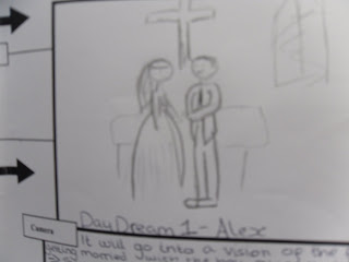
In our postproduction we used the Apple Mac computers, which contain ‘Final Cut pro’ to edit all our footage. Eugene was our main editor and used many different effects, such as a ripple dissolve to fade out some clips and also a ‘colour de-saturate’ was used, with a ‘soft edges’ for the clips which show footage which is a post to be from the past. Using a black and white effect creates the feeling of that we showing past events or the dream and intrigues the views to think who past is still going to be present. So by the end of the video we relies Alex is the one who gets the boy, and we re-introduce the wedding footage however it is the clip of Alex and Eugene doing a confirmation of love in a wedding kiss, this is now seen in colour to show this is now the present and reality.
‘Adobe Photo Shop’ was used for the making of the CD cover and magazine advertisement. This means that we would be able to produce a good quality cover and magazine advertisement as photo shop is the same type of software, which is used by the professionals. We could use a wide range of different image styles effects and colours to make our products stand out. However looking at the text fonts provided by Photoshop are limited. Therefore I went onto the website ‘www.dafont.com’ and downloaded new fonts such as the ‘Riesling’ which was used as the text on the CD covers. The downloads were a huge complement because they helped produce a good quality cover.


